PROJECT OVERVIEW
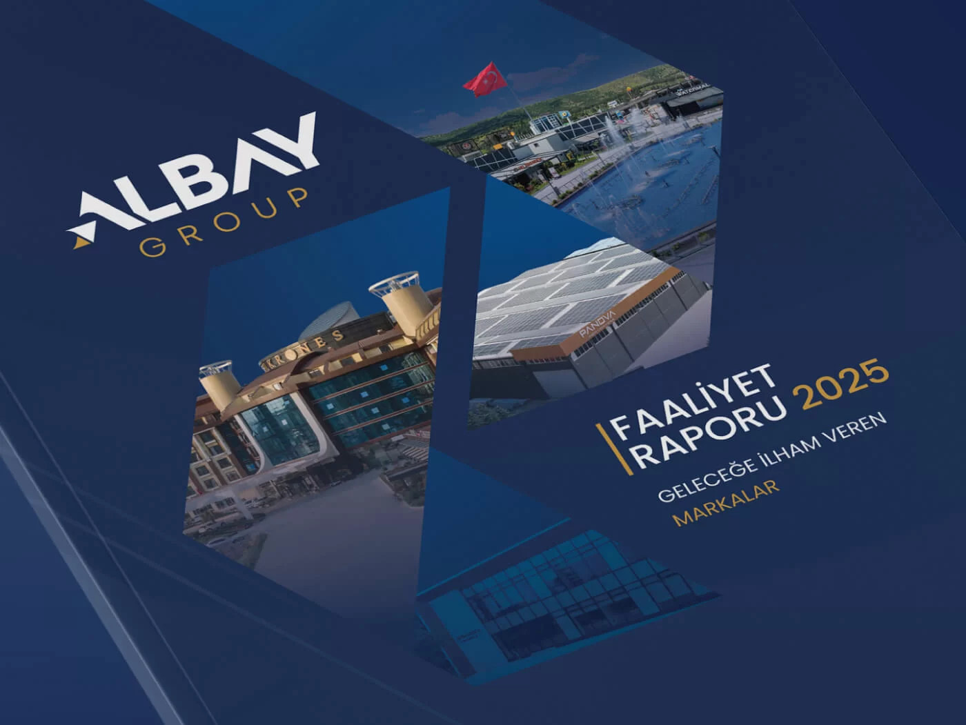
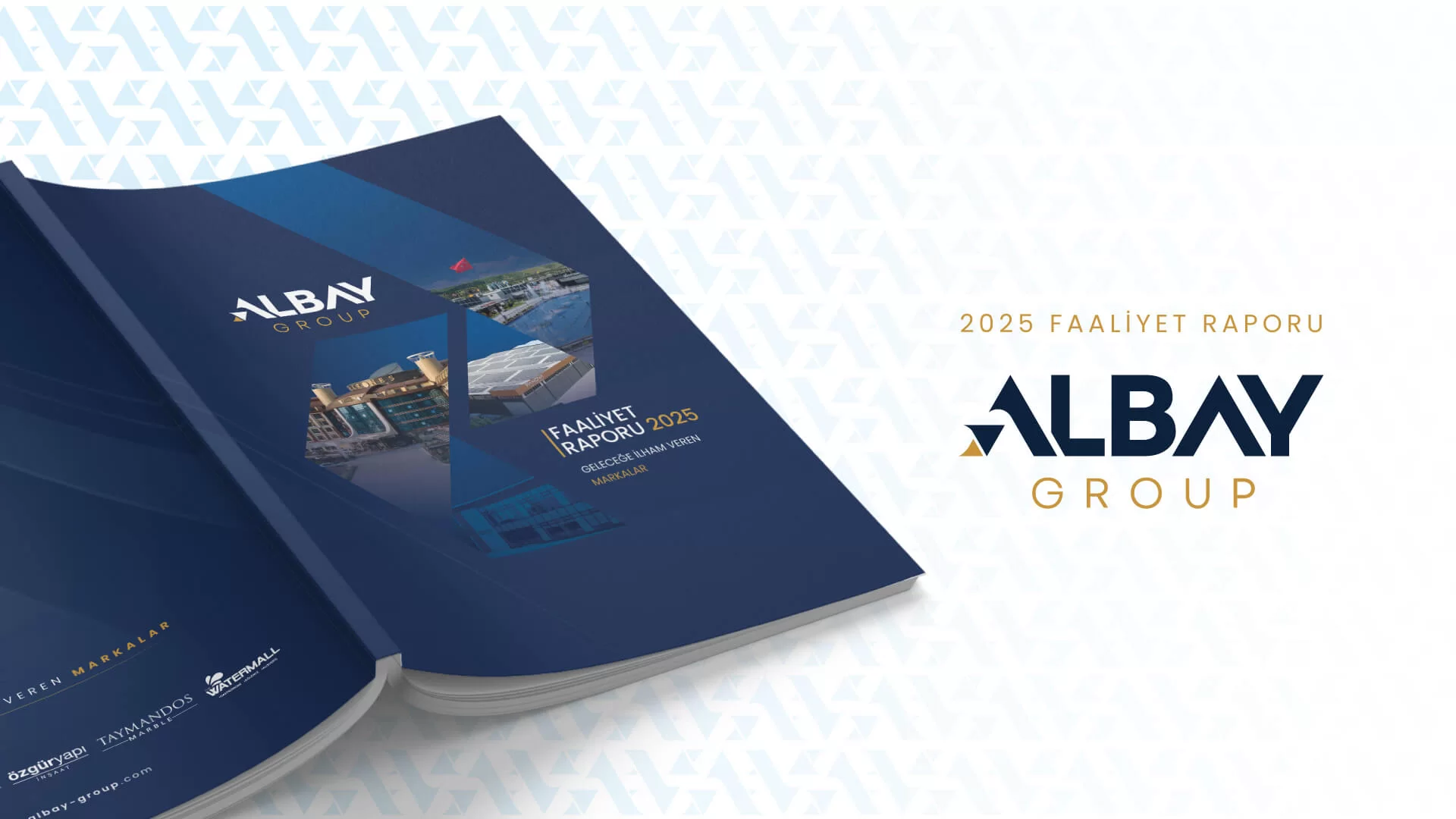
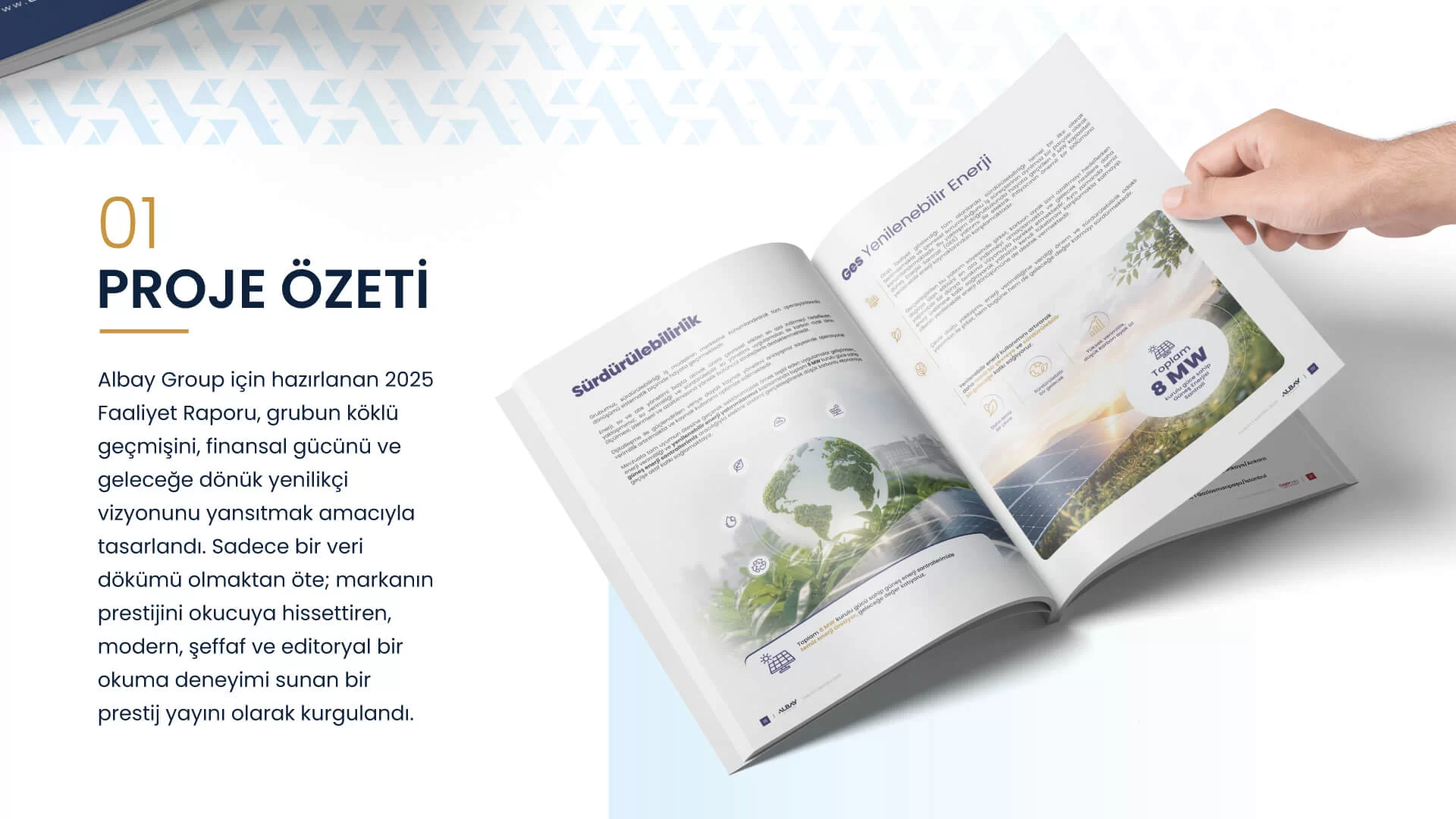
The 2025 Annual Report prepared for Albay Group was designed to reflect the group’s long-established heritage, financial strength, and forward-looking innovative vision. More than a collection of data, it was conceived as a prestigious publication that conveys the brand’s stature while offering a modern, transparent, and editorial reading experience.
DESIGN PHILOSOPHY AND APPROACH
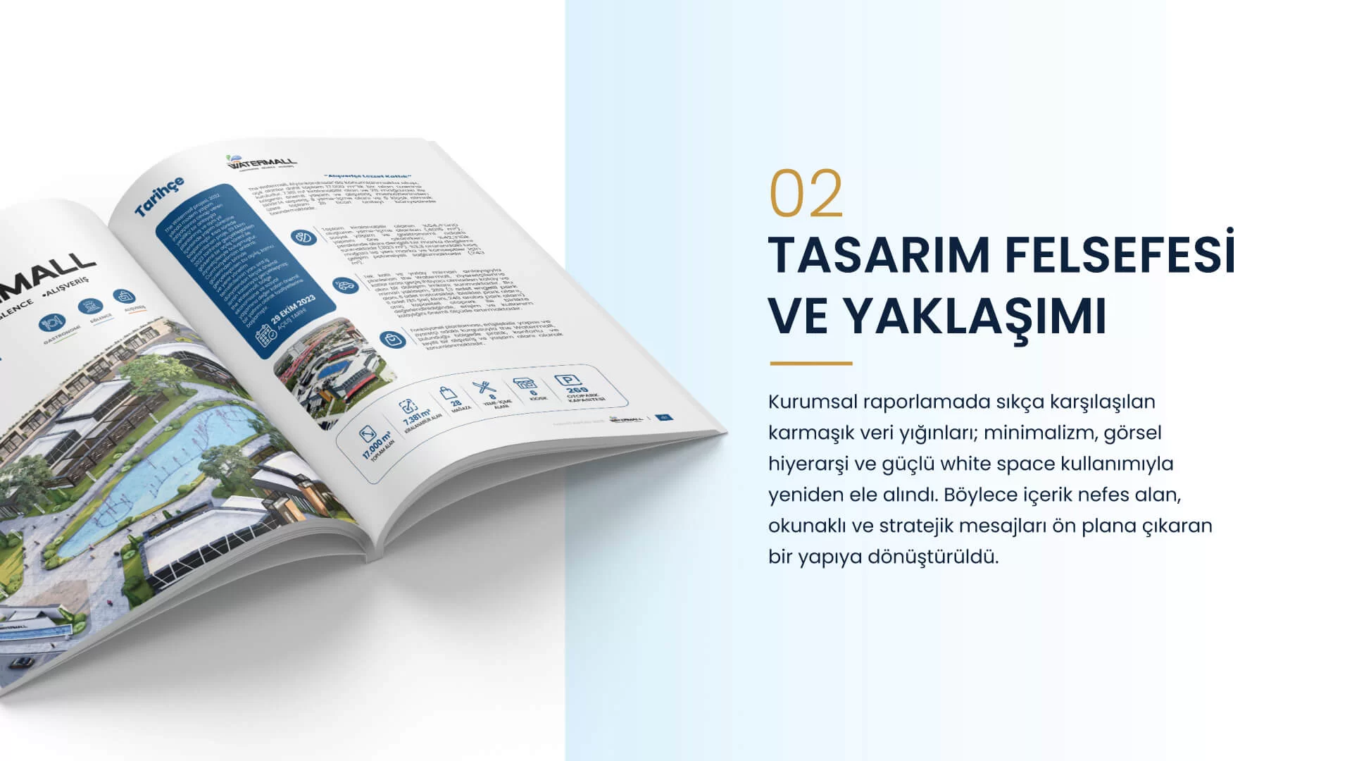
We reshaped the often dense and complex data structures found in corporate reporting through the principles of minimalism and visual hierarchy. The generous use of negative space allows the content to breathe, helping readers focus directly on key figures, strategic messages, and the company’s achievements.
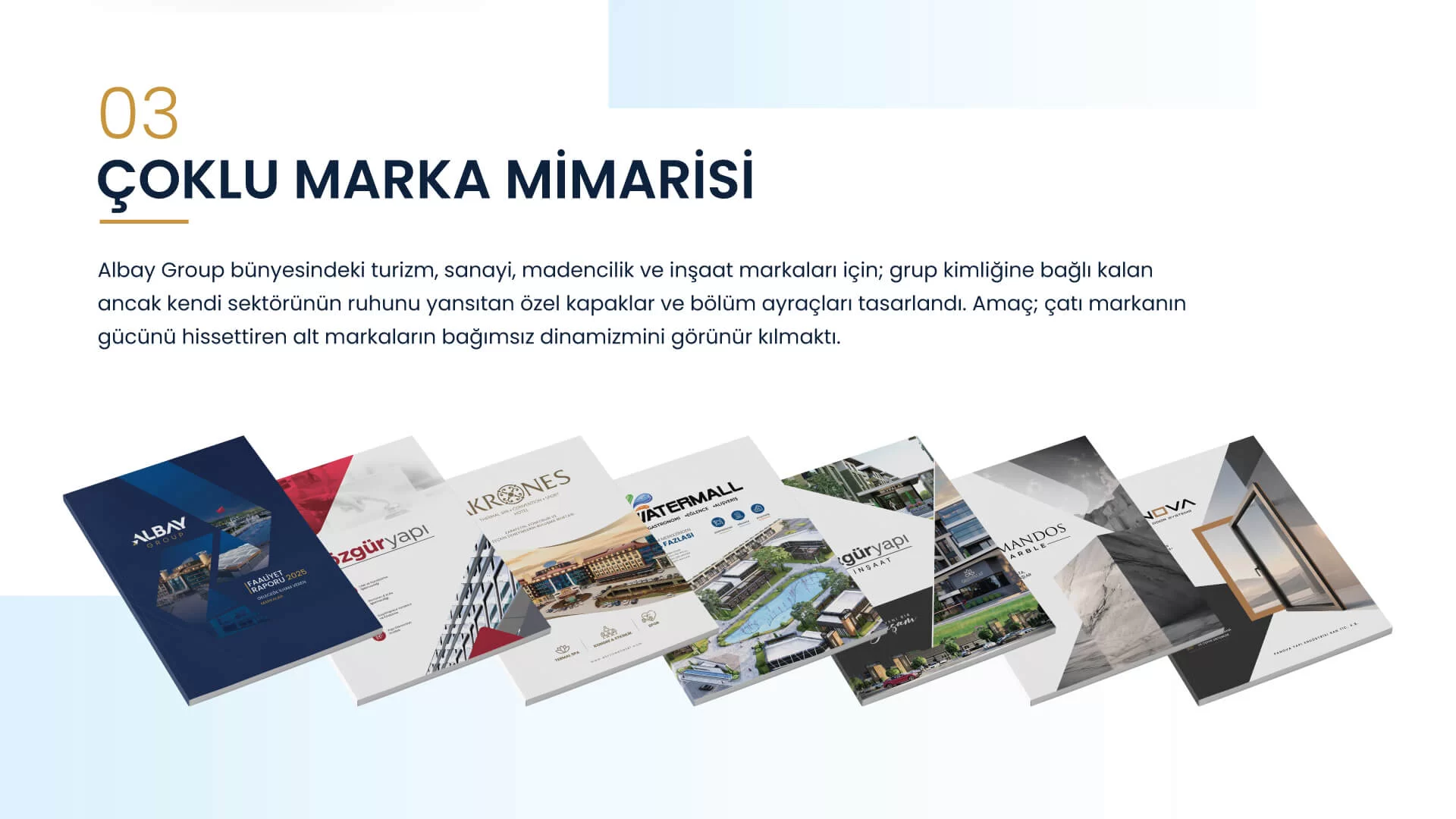
MULTI-BRAND ARCHITECTURE: A DISTINCT IDENTITY FOR EVERY SECTOR
Albay Group brings together a diverse portfolio of strong brands spanning tourism (Akrones Hotel), industry (Panova and Taymandos), and construction (Özgür Yapı). Rather than forcing this extensive structure into a single uniform design language, we created bespoke covers and divider pages for each company—remaining loyal to the group’s overall identity while reflecting the character of its individual sector. Why did we do this? Our aim was to communicate the strength of the group as a whole while highlighting the independent presence, dynamics, and vision of each sub-brand within its own market through tailored visual worlds.
TYPOGRAPHY: THE BALANCE OF STRENGTH AND ELEGANCE
To ensure readability and establish the brand’s tone of voice, we selected font families that create a strong and refined contrast:
- Headlines – Poppins: With its geometric, strong, and modern character, Poppins was used for headlines and subheadings to represent Albay Group’s solid presence, reliability, and determination within the industry.
COLOUR PALETTE: THE CORPORATE LANGUAGE EXPRESSED THROUGH COLOUR
Throughout the design, we used a palette that reflects the brand’s corporate authority without compromising its contemporary character:
- Deep Navy: Used across backgrounds and key accents as the primary colour representing trust, corporate authority, stability, and professionalism.
- Elegant Gold: Strategically positioned in details, icons, and divider pages to symbolise the quality, luxury—particularly within brands such as Akrones and Taymandos—and added value of Albay Group’s investments.
- Crisp White & Grey Tones: Preferred for backgrounds to present financial data and infographics with clarity while bringing spaciousness and refinement to the overall design.
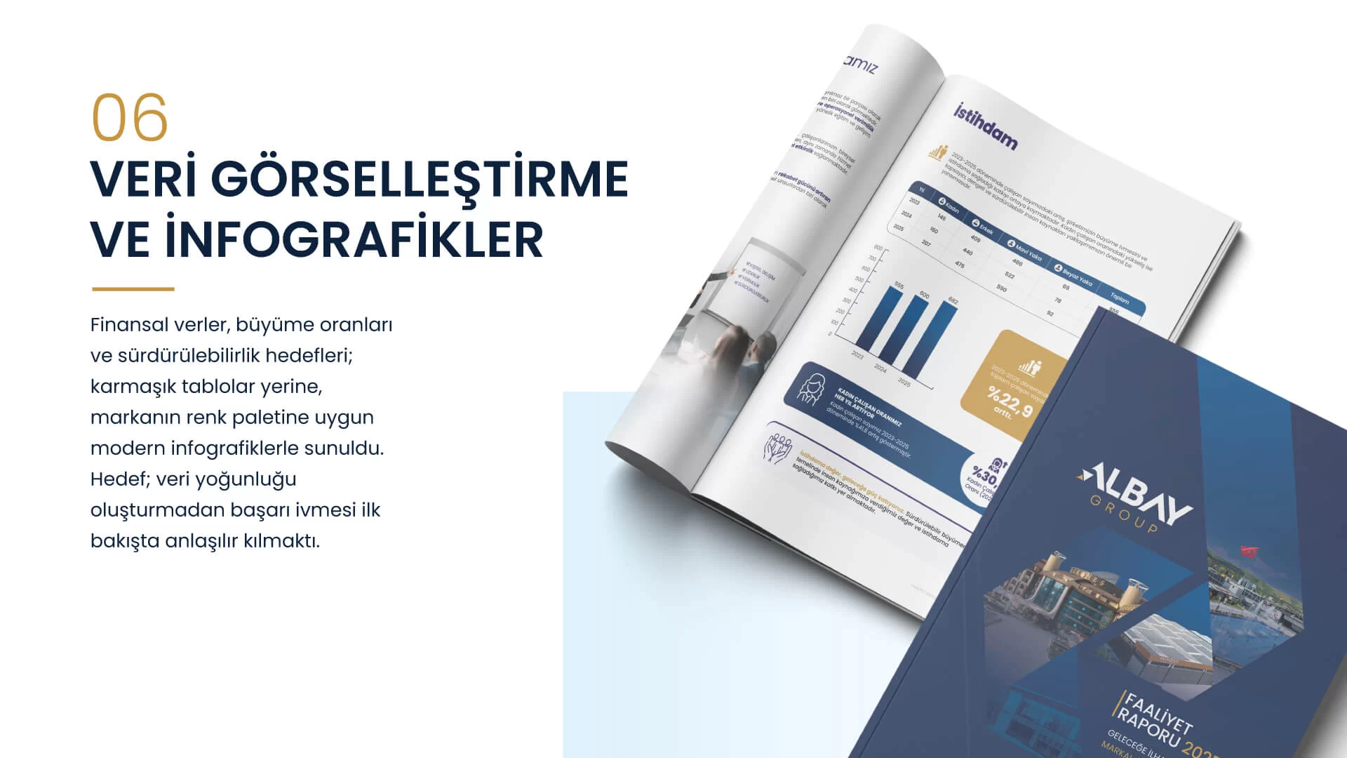
DATA VISUALISATION AND INFOGRAPHICS
Financial statements, growth indicators, and sustainability targets were transformed into clear, contemporary infographics aligned with the brand’s colour palette, rather than being presented as complex Excel-style tables. The objective was to enable investors, stakeholders, and employees to grasp Albay Group’s growth momentum in 2025 at a glance—without experiencing data fatigue.
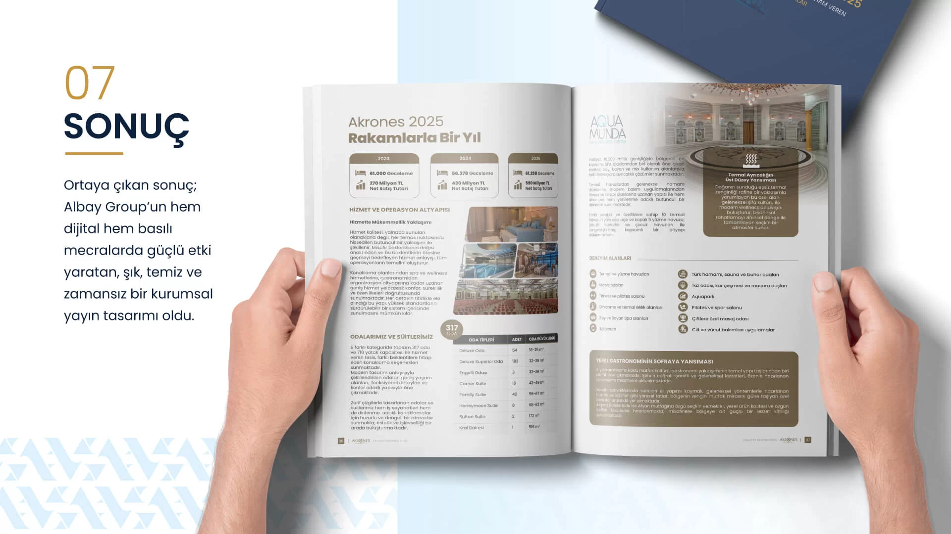
CONCLUSION
The final result is an elegant, clean, and timeless corporate publication design that successfully carries Albay Group’s vision across both national and global platforms, delivering the same impact in print and digital formats.